
TL;DR

Get kitchen staples and gadgets delivered free — and shop member deals
- Fast, free delivery on millions of items
- Access to Prime Big Deal Days deals on October 6–7
- Prime Video, Amazon Music and more included
This article provides a step-by-step guide for homeowners to select cohesive pale color schemes for kitchens. It emphasizes starting with fixed elements and building a balanced palette for a timeless, practical space.
Choosing the right pale color scheme for a kitchen can transform the space into a timeless, cohesive environment, but it often feels overwhelming for homeowners. This expert guide offers a structured five-step framework to simplify the process, emphasizing starting with fixed elements and layering complementary tones.
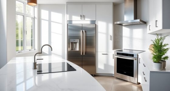
Design professionals recommend beginning with the most permanent features, such as countertops, flooring, and cabinetry, which influence the overall palette. For example, a marble countertop with blue-gray veining suggests cooler tones, while warm-toned oak floors steer the color scheme toward golden hues. Once the fixed elements are identified, the dominant color—often cabinetry—should reflect the desired mood, whether it’s warm white, mushroom, or deep navy. Building a supporting palette involves selecting secondary colors that enhance the main tone without overwhelming the space, creating a balanced and inviting kitchen environment.
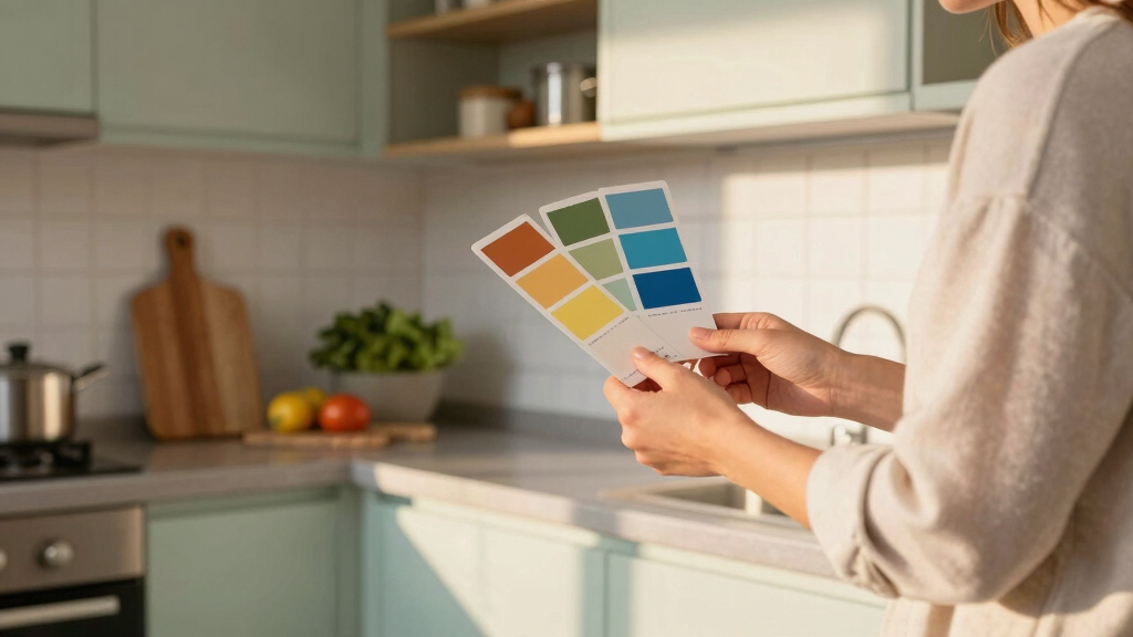
Experts advise pulling colors from existing surfaces to guide paint choices, ensuring cohesion. For instance, a chalky white tile may lead to choosing a soft white wall color. The approach prioritizes harmony and longevity over fleeting trends, aiming for a space that feels both stylish and practical for years to come.
Why a Cohesive Pale Palette Matters in Kitchen Design
A well-chosen pale color scheme enhances the kitchen’s aesthetic appeal and functionality, making the space feel larger, brighter, and more inviting. It also creates a neutral foundation that allows homeowners to incorporate personal touches through accessories and accents, ensuring the kitchen remains timeless and adaptable over time. Proper palette selection reduces the risk of costly mistakes and helps achieve a harmonious look that aligns with the home’s architecture and the homeowner’s lifestyle.
As an affiliate, we earn on qualifying purchases.
The Role of Fixed Elements in Kitchen Color Planning
Kitchen design professionals emphasize that fixed elements like countertops, flooring, and cabinetry are crucial starting points for selecting a color scheme. These features are often the most expensive to change and carry significant visual weight. For example, a marble countertop with cool undertones naturally guides the palette toward cooler wall colors, while warm-toned wood floors support a warmer, earthier scheme. This approach aligns with industry best practices, which suggest layering colors around these permanent features for a cohesive outcome.
“Before we look at a single paint chip, we look at the ‘soul’ of the home. This leads us toward the color palette naturally.”
— Alissa Pulcrano, Bright Designlab
white kitchen cabinets with countertops
As an affiliate, we earn on qualifying purchases.
As an affiliate, we earn on qualifying purchases.
Unresolved Questions About Pale Color Combinations
It remains unclear how specific pale shades perform over time in different lighting conditions, or how they coordinate with various materials and textures. Additionally, individual preferences and trends may influence the longevity of chosen palettes, but definitive long-term studies are lacking.
pale color palette for kitchen walls
As an affiliate, we earn on qualifying purchases.
As an affiliate, we earn on qualifying purchases.
Next Steps for Homeowners Planning a Kitchen Remodel
Homeowners should begin by assessing their fixed elements and gathering inspiration that aligns with their home’s architecture. Consulting with professional designers can help refine the palette and ensure cohesion. Future developments may include new paint technologies or materials that offer greater flexibility and durability for pale color schemes.
kitchen color scheme accessories
As an affiliate, we earn on qualifying purchases.
As an affiliate, we earn on qualifying purchases.
Key Questions
How do I choose a pale color that won’t look washed out?
Select shades with enough depth or warmth to add dimension, and consider the lighting in your kitchen. Testing paint samples in different areas helps determine how colors appear at various times of day.
Should I match my cabinet color to my countertops?
Not necessarily. While pulling colors from your countertops can guide your palette, creating contrast or harmony depends on your overall design goals. Consulting a designer can help balance these elements effectively.
Are there specific finishes or textures that complement pale colors?
Matte, eggshell, or satin finishes work well with pale shades, adding subtle texture and reducing glare. Incorporating natural materials like wood or stone enhances the layered, cohesive look.
How can I ensure my pale color scheme remains timeless?
Choose classic shades with complex undertones, avoid overly trendy colors, and focus on creating harmony with your fixed elements and overall home style.
Source: Homes & Gardens
NFL season / tailgating Picks
team gear
As an affiliate, we earn on qualifying purchases.